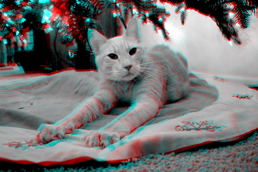
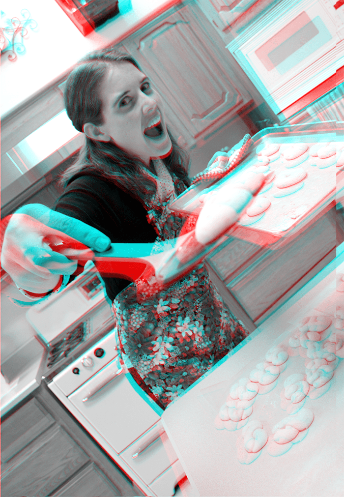
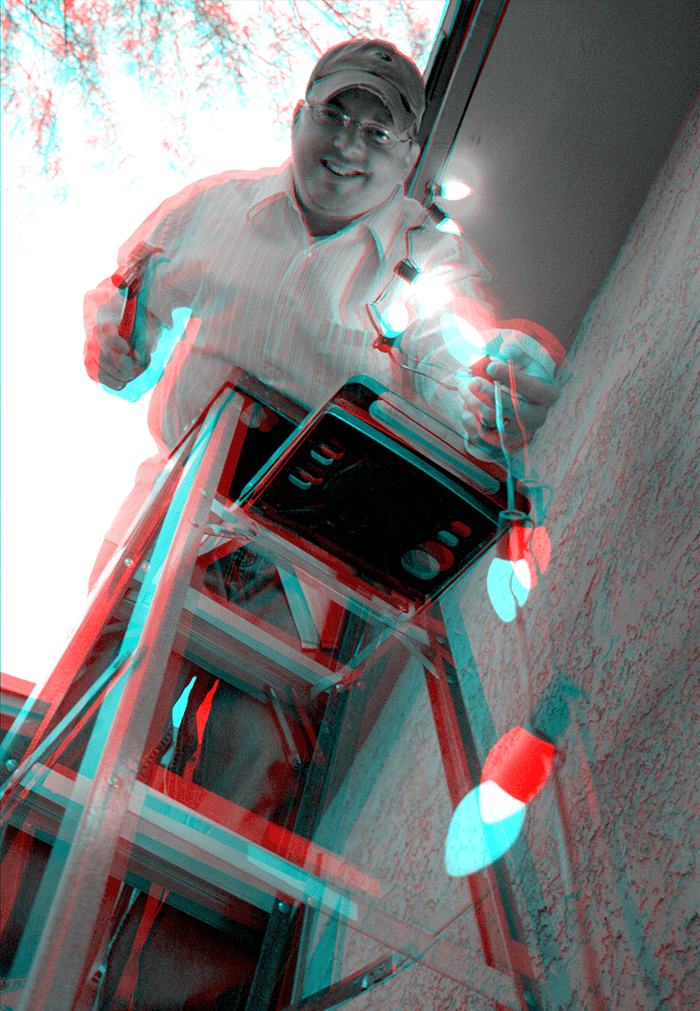
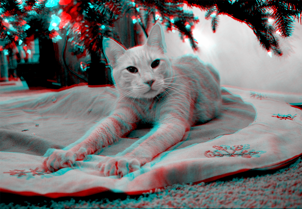
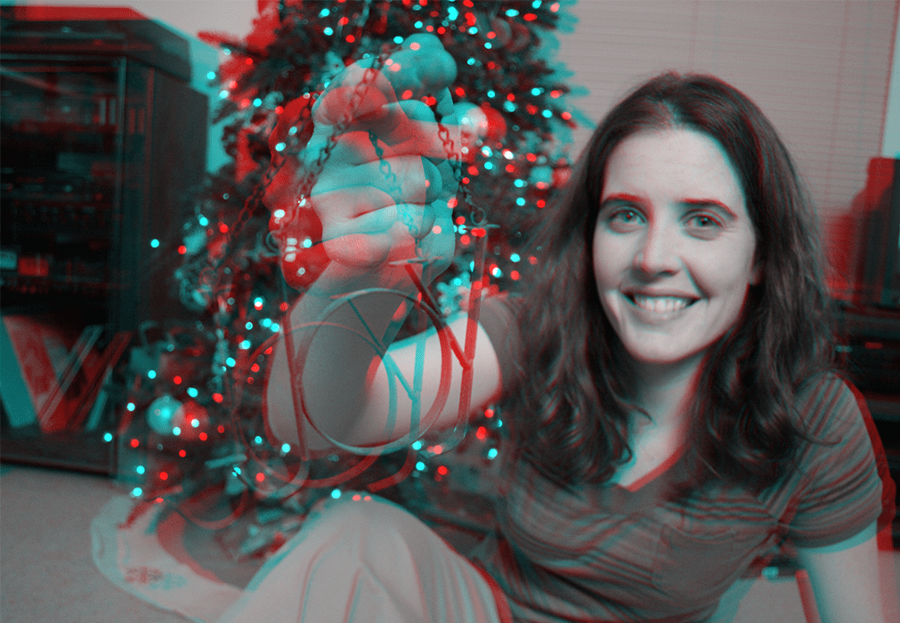
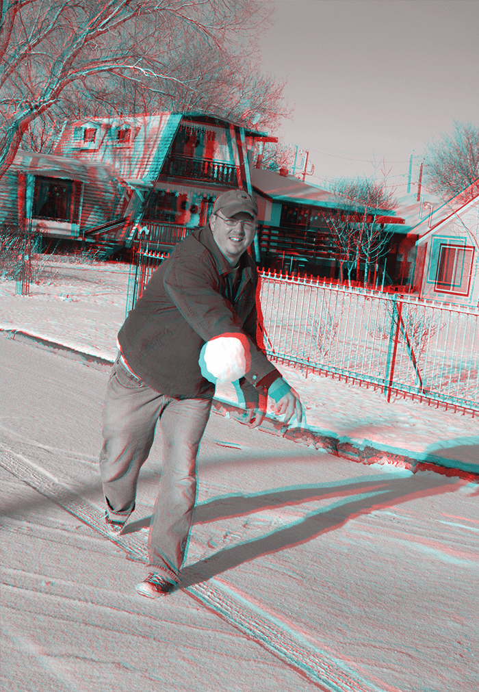
My wife and I used to go all-on for Christmas cards, investing indefensible amounts of time and money on an annual creative venture that was as fun for us to produce as it (hopefully) was for our family and friends to receive it. One year, we shipped a stack of printed 3D photos with the old-school red-and-blue 3D glasses for a genuinely old-school immersive look into our holiday season!
Dawn (my wife) was in charge of the photography, and I pieced the results together by manipulating the channels in Photoshop. The final product was a single card with a URL to a website that hosted a flurry of other fun 3D photos.
Highlights from dozens of pro bono family projects
As the only graphic designer in a family with eight siblings, I was often involved with the design and printing of announcements and invites for special occasions. My twin brother would famously volunteer me for for design work claiming that “it would only take ten minutes.” The truth it, I enjoyed these projects immensely as opportunities to collaborate with my bros and sisters in creative ways that we probably wouldn’t otherwise, and to be able to do my part to make their event super special.
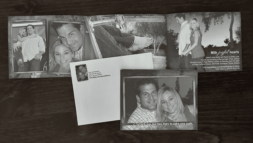
Little sis’ wedding invite
When my little sis was getting married to her fireman fiancé, my photographer wife and I collaborated to deliver this awesome tri-folded custom invite printed in a sepia Pantone with a matching envelope.
Blueberry Elephant
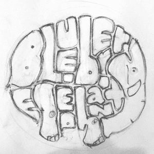
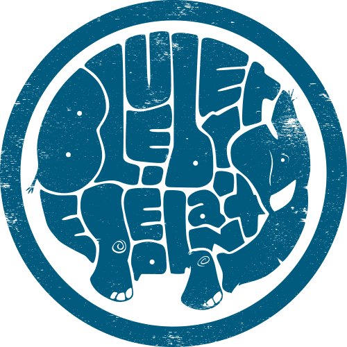
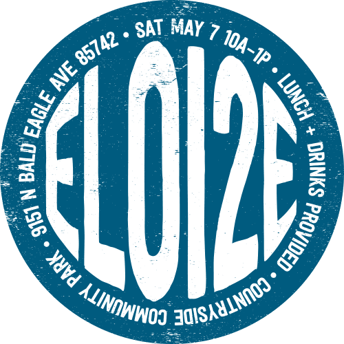
For my daughter’s second birthday’s “blueberry elephant” theme, I drew this super fun calligram and printed it in a single spot-color on round invites:
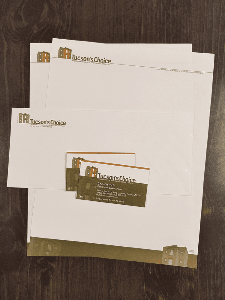
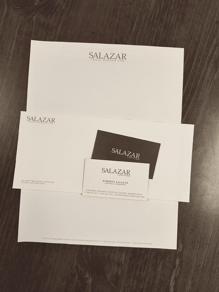
Old-school standard deliverables for new logo design clients.
Before the world was consumed by smart phones and Facebook, the go-to means of business communication was still old-fashioned direct mail. Letterhead and envelopes were printed en masse and stashed in the office cupboard (often with blank stock for second pages) and often in a dedicated LTR tray in the office printer so invoices, statements, collection efforts, and other formal correspondence could be quickly sent to the printed, hand-folded, stuffed into a pre-printed #10 envelope with a 29¢ stamp, and sent in the outgoing mail to be delivered in a few days.
For graphic designers, the business system — which typically included business cards for key client-facing team members, letterhead, a #10 business envelope, and possible pre-addressed #9 return envelopes — was a standard deliverable for all identity development!
The case of the blasés: a much-needed corporate brand overhaul
When I joined DTN in 2017, the company’s logo was suffering from a serious case of the blasés, featuring a decades-old “all-lowercase” treatment for the acronym mark with a predictable early 2000s light/heavy type treatment, a cliché mid-90s mouse icon, a random swoosh, and a gloomy blue, sea green, and dark grey color palette:
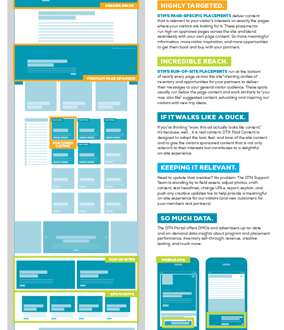
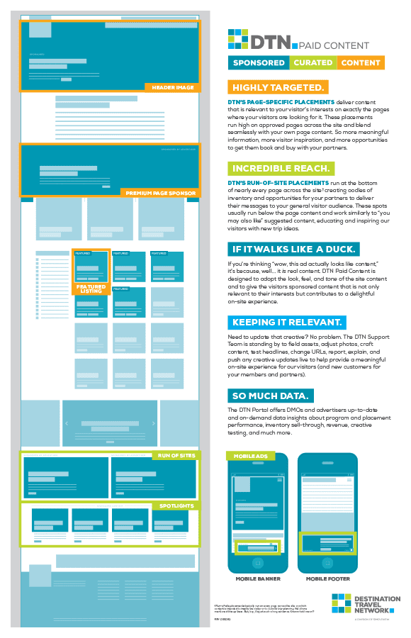
The collateral was designed well enough — clean layout, organized visual hierarchy — but the impact was diminished by lackluster brand standards, boring corporate stock photography, and a generally poor understanding of how cool the company and the product really was. The flagship product, DTN Paid Content, was an assortment of native content ad placements on tourism websites that featured exciting local visitor attractions, restaurants, and places to stay that helped inspire DMO website visitors in their trip-planning and connected new customers to SMBs in the market. Yet all of the branding looked as though we were selling circuit boards.
But wait. it gets worse.
The greatest indiscretion was the fact DTN targeted the wrong audience on all of its online and printed collateral. Ultimately, DTN has a dual-customer audience: the DMO, without whose website DTN cannot run DTN Paid Content, and the small businesses (SMBs) who will ultimately give DTN (and, with revenue sharing, the DMO) their money. But, despite the fact that the SMBs are the end customer, all of DTN’s messaging was tailored for the DMO and completely ignored the SMB, creating an online experience in which the small business owner would go to the DTN home page to find, not information about how DTN can help with their small business marketing, but an online calculator that estimated how much money the DMO would make off of them.
Time to take action.
In 2019, I started to hear murmurs of DTN’s new initiative to expand the DTN product set to include more digital marketing products, and that (presumably) would include a marketing push with DTN’s awful logo and misguided website. And I couldn’t, in good conscience, let that happen without at least proposing a serious brand refresh.
So I took time in my off-hours to build out a new company logo that would be versatile enough to develop new product logos in the same family and to overhaul the company’s communications strategy to focus on how DTN’s products satisfy the digital marketing needs of small business owners and marketers.
Solution:
Brand manual
I developed a fully fleshed-out brand manual outlining comprehensive brand standards, including details about proper logo application, type and color standards, image and copy voice standards, and deployment examples. (The final brand manual can be downloaded here.) Instead of mailing the PDF, I printed several copies of this in full color, bound them into small booklets, and mailed them to my Director. He immediately took them to company leadership and, after a few minor changes, we received the green light to embrace the new brand. Here are the details:
Bold, future-forward logo lock-ups
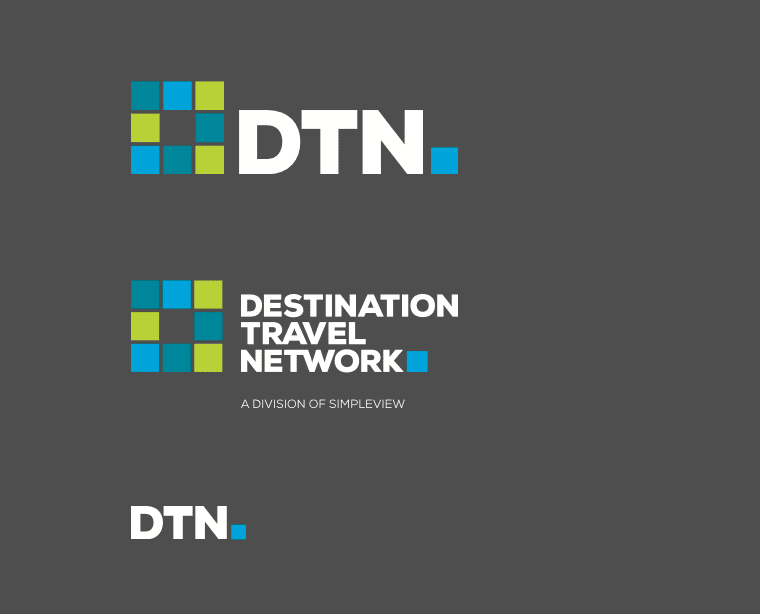
The new DTN logo lockup features bold contrast with a brighter color palette, abandoning the lowercase type treatment for a more confident heavyweight all-caps. Most of the printed collateral employed bold white type with short, punchy headlines to help the message land quickly.
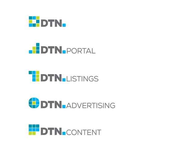
The mark of the DTN logo was intentionally developed to pave the way for family product branding down the road.
Flourishes were added to help professionalize the brand, such as this animated variation for the DTN Portal, DTN’s advertising performance reporting platform.
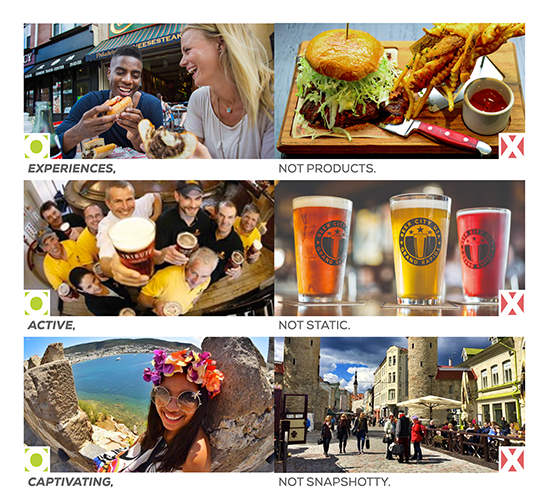
The new DTN brand imagery standards abandoned the corporate stock photography and went all-in for photos that highlighted the visitor’s experience in the market.
The updated DTN brand voice moved away from stuffy self-promotion and fluffy promises to the DMO audience and towards confident statements about how the DTN product set will help with the SMB’s digital marketing needs.
The new website was designed wholly for the SMB audience with an active voice, engaging new imagery, and with a renewed focus on product attributes and value proposition and the ability for SMBs to buy DTN products online.
Messaging to the DMO audience was relocated to a dedicated landed page found in the site’s secondary nav and featured the updated copy voice and aesthetic.
And I introduced a dedicated back-end portal where prospective customers could demo the DTN Website product and access a library of HOW-2 articles about digital marketing best practices.
It still stings.
Eight years of my career just tossed to the side with as much as a “thank you” from my managers or colleagues — it’s a tough pill to swallow. But I delight in the reality that my team and I made strides at DTN that the organization could never have accomplished without us. And my direct contributions to DTN’s brand strategy will have long-term effects on the way DTN is perceived by both SMBs and DMOs.
Designing a versatile team brand for unique applications
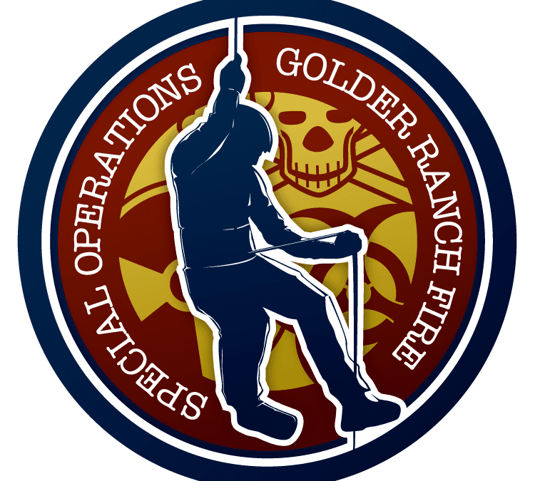
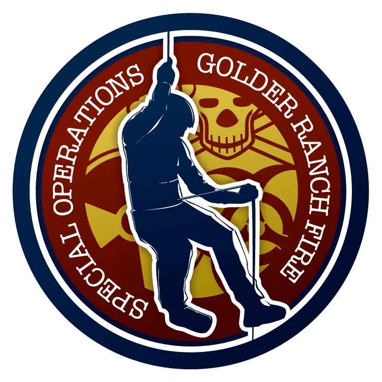
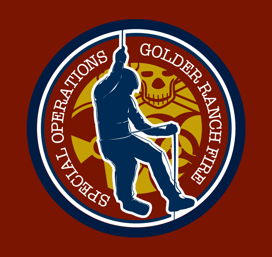
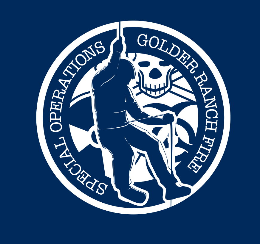
This patch design was commissioned for the Special Ops team at the Golder Ranch Fire Department in north Tucson, Arizona. The seal designed highlighted the physical abilities of this special team along with the treacherous circumstances they have to deal with. The figure rappelling was hand-drawn and manipulated in Illustrator. The primary seal was designed in four-color process for use on letterhead and envelopes with RGB counterparts for web applications. But we needed distilled versions for a vinyl cut application on the firehouse floor and the sides of the engines, and a single-color solution for department t-shirts.
FINAL DESIGN
DIE-CUT STICKER ON FIRE TRUCK
DISTILLED TO SINGLE-COLOR WHITE FOR SCREEN PRINTING
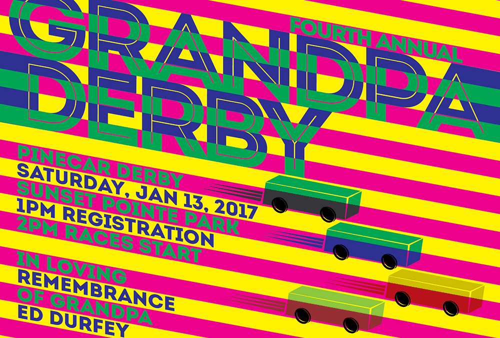
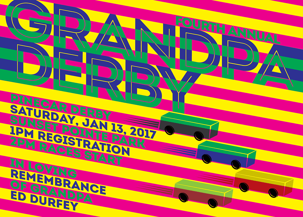
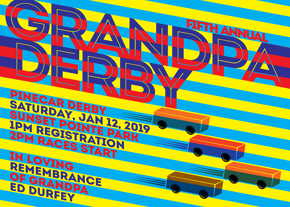
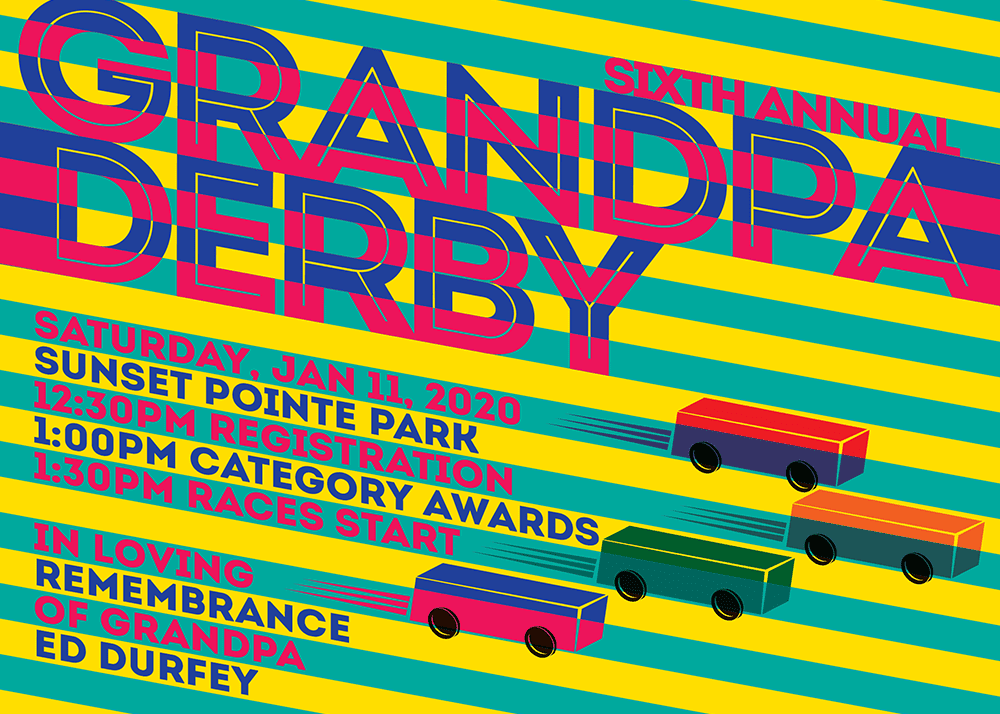
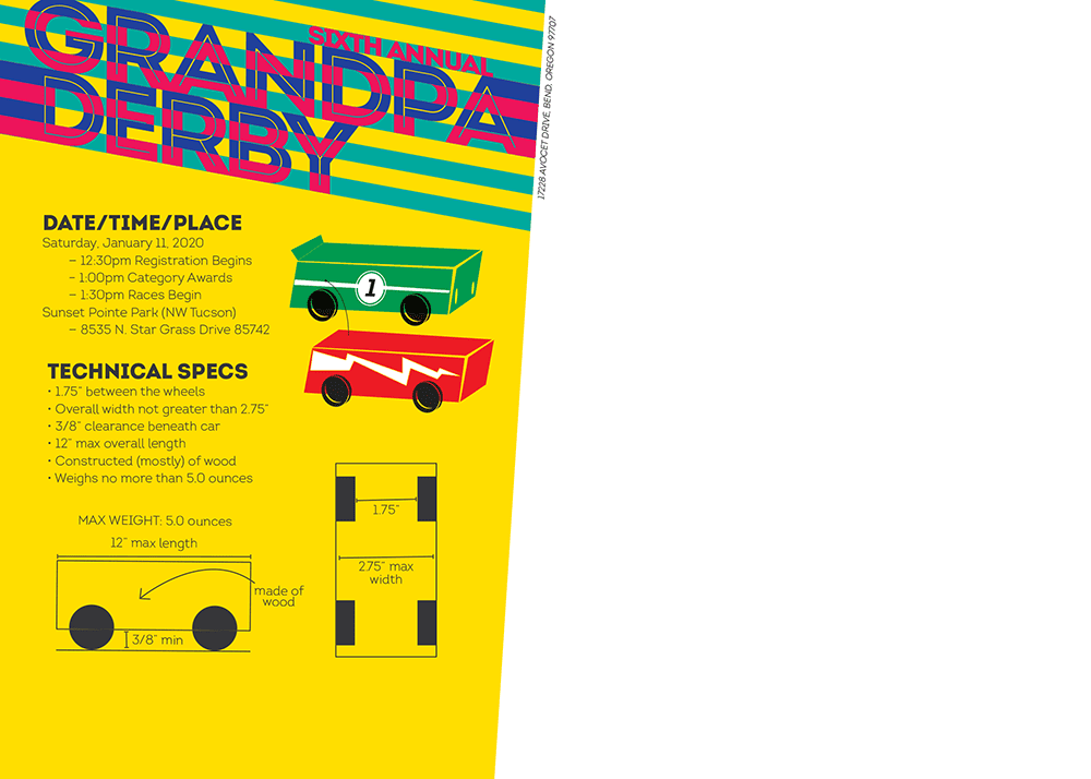
The Grandpa Derby was an informal pinewood derby competition designed to remove the hyper-competition from the traditional Pinewood Derby and replace it with it with a creative DIY solution that encouraged . My brother and I created the event in honor of my late grandfather who was a carpenter by trade and helped us build our pinewood derby cars in our youth. This postcard was printed 4/4 on 18.5pt cover stock wThe event lasted three (non-consecutive) years before most of the kids outgrew the event.
With this design, I was especially excited to play around with color vibration and a retro art style. Knowing that it was going to be an annual event, I wanted a solution that would carry the aesthetic from one year to the next but would provide enough versatility to change a few things for that specific event.
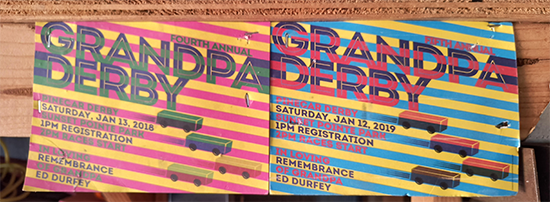
I still have a couple hanging in my garage in remembrance of Grandpa:
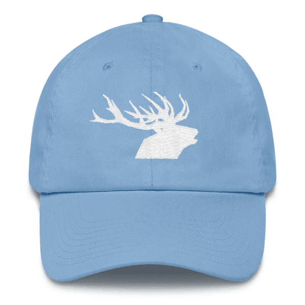
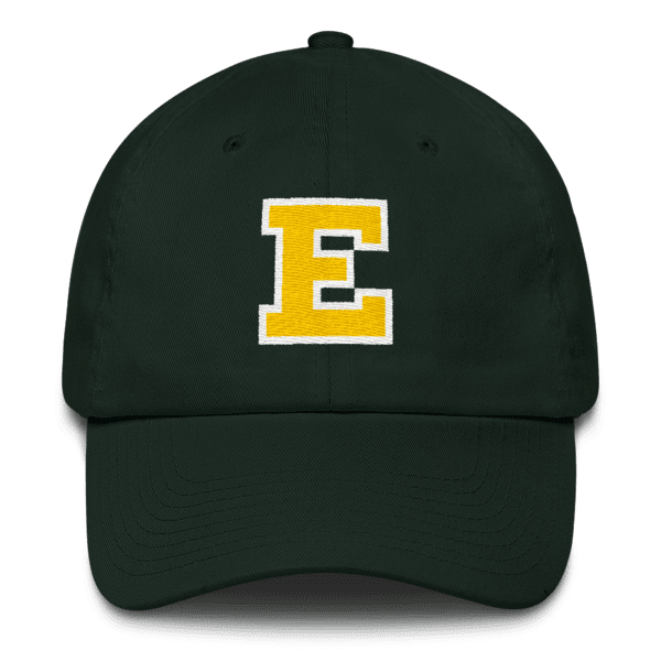
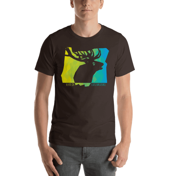
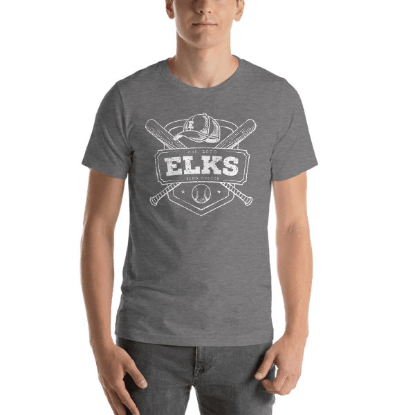
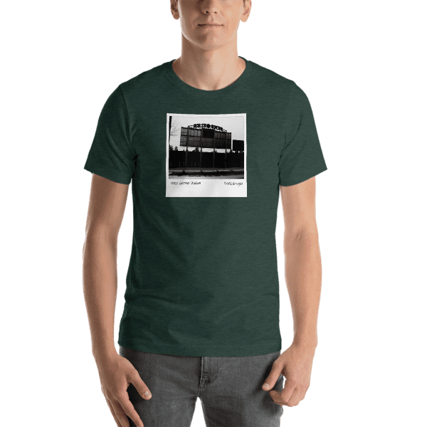
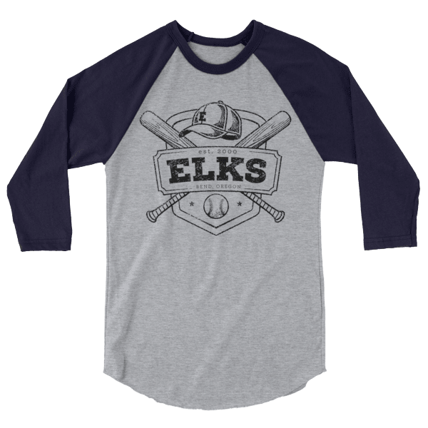
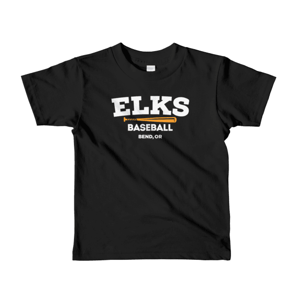
Central OR Ball was an apparel side project that I launched after feeling frustrated the the souvenir shop at the local Bend Elks game had a lackluster selection of well-designed merch. The idea was to put together a series of out-of-the-box Elks merch that towed the line of fan fare and trademark infringement. It also included fun gear celebrating youth softball/baseball and adult rec leagues — baseball in Bend from February through August. By the following season, the Elks merch tables had significantly improved the quality of their designs.
Brian DeMarco was a Flagstaff-based musician with whom I worked throughout my undergrad years. We collaborated on dozens of creative projects, including the design of five album covers and CD designs (and we reconnected in recent years for another) and promotional posters, flyers, and websites. He was, and is still, a close friend of mine and we’ll occasionally collaborate on new projects to this day.
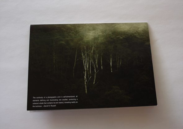
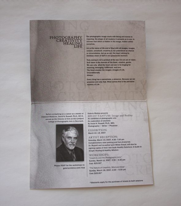
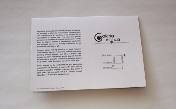
This is an invitation to the opening reception for the exhibit highlighting the photographic works of David Russell, a Tucson-based photographer and author, at Galería Mistica located in Tucson’s historic Fourth Avenue District. The invite was printed in full-color on the front and black and white on the inside on a have smooth cover stock and a center score. Whenever I work with artists, I need to pay special attention to the color accuracy of the image to ensure the piece is represented as close to actual color as possible.
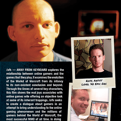
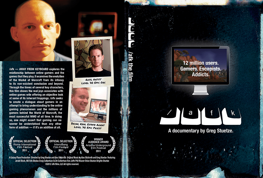
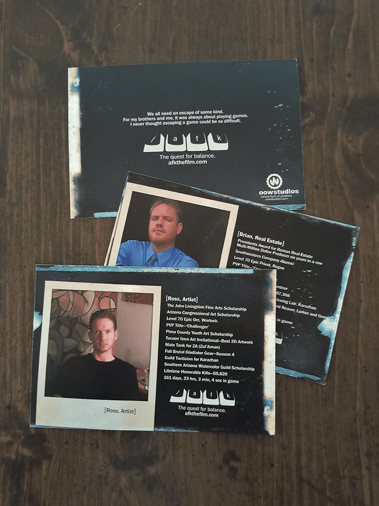
/afk — AWAY FROM KEYBOARD is a 2011 documentary that follows two brothers through an introspection of their lives in and out (and in again) of the World of Warcraft and a larger look at the online gaming phenomenon and addiction. Filmed, edited, and produced by a good pal of mine, the film garnered rave reviews and played an important role in helping to shed light on a relatively new phenomenon that is impacting countless families across the globe. I was approached to help with the creative for the films promotions, including the design of the DVD cover, promotional postcard handouts, and a basic t-shirt.
From a creative perspective, the goral was to highlight these real life characters and illustrate the duality of their lives — half (or more) in the video game, and the remainder with their families. Biographical postcards were produced highlighting their IRL accomplishments adjacent to their in-game stats, illustrating the blurring of the two lives. The film screened at The Loft Cinema in Tucson. The director of the film, Greg Stuetze, credited me with art direction on IMDB.