
The case of the blasés: a much-needed corporate brand overhaul
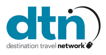
When I joined DTN in 2017, the company’s logo was suffering from a serious case of the blasés, featuring a decades-old “all-lowercase” treatment for the acronym mark with a predictable early 2000s light/heavy type treatment, a cliché mid-90s mouse icon, a random swoosh, and a gloomy blue, sea green, and dark grey color palette:
The collateral was designed well enough — clean layout, organized visual hierarchy — but the impact was diminished by lackluster brand standards, boring corporate stock photography, and a generally poor understanding of how cool the company and the product really was. The flagship product, DTN Paid Content, was an assortment of native content ad placements on tourism websites that featured exciting local visitor attractions, restaurants, and places to stay that helped inspire DMO website visitors in their trip-planning and connected new customers to SMBs in the market. Yet all of the branding looked as though we were selling circuit boards.
But wait.
it gets worse.
The greatest indiscretion was the fact DTN targeted the wrong audience on all of its online and printed collateral. Ultimately, DTN has a dual-customer audience: the DMO, without whose website DTN cannot run DTN Paid Content, and the small businesses (SMBs) who will ultimately give DTN (and, with revenue sharing, the DMO) their money. But, despite the fact that the SMBs are the end customer, all of DTN’s messaging was tailored for the DMO and completely ignored the SMB, creating an online experience in which the small business owner would go to the DTN home page to find, not information about how DTN can help with their small business marketing, but an online calculator that estimated how much money the DMO would make off of them.
Time to take action.
In 2019, I started to hear murmurs of DTN’s new initiative to expand the DTN product set to include more digital marketing products, and that (presumably) would include a marketing push with DTN’s awful logo and misguided website. And I couldn’t, in good conscience, let that happen without at least proposing a serious brand refresh.
So I took time in my off-hours to build out a new company logo that would be versatile enough to develop new product logos in the same family and to overhaul the company’s communications strategy to focus on how DTN’s products satisfy the digital marketing needs of small business owners and marketers.
Solution:
Brand manual
I developed a fully fleshed-out brand manual outlining comprehensive brand standards, including details about proper logo application, type and color standards, image and copy voice standards, and deployment examples. (The final brand manual can be downloaded here.) Instead of mailing the PDF, I printed several copies of this in full color, bound them into small booklets, and mailed them to my Director. He immediately took them to company leadership and, after a few minor changes, we received the green light to embrace the new brand. Here are the details:
Bold, future-forward logo lock-ups
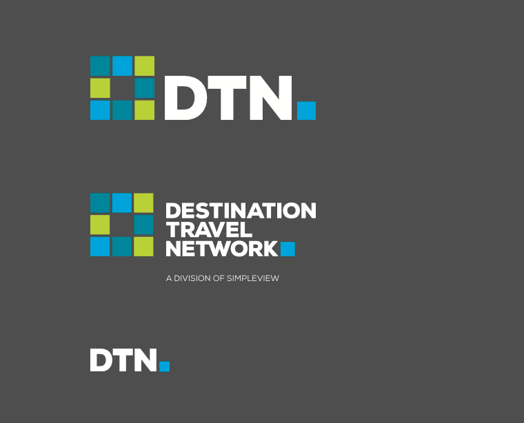
The new DTN logo lockup features bold contrast with a brighter color palette, abandoning the lowercase type treatment for a more confident heavyweight all-caps. Most of the printed collateral employed bold white type with short, punchy headlines to help the message land quickly.
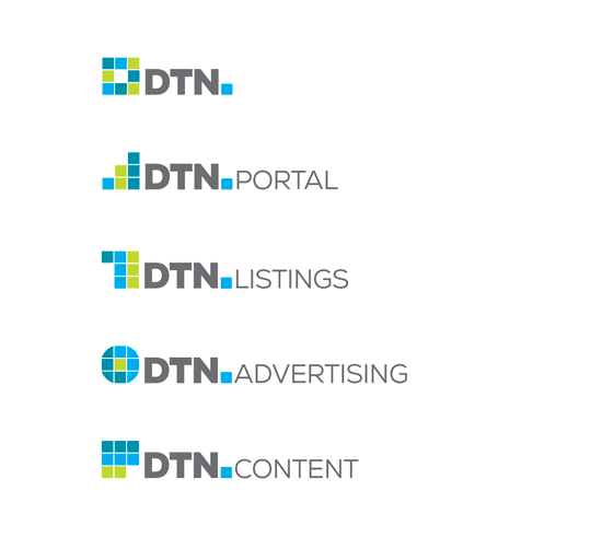
The mark of the DTN logo was intentionally developed to pave the way for family product branding down the road.

Flourishes were added to help professionalize the brand, such as this animated variation for the DTN Portal, DTN’s advertising performance reporting platform.
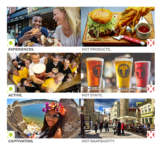
The new DTN brand imagery standards abandoned the corporate stock photography and went all-in for photos that highlighted the visitor’s experience in the market.
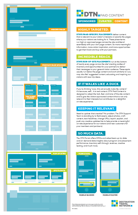
The updated DTN brand voice moved away from stuffy self-promotion and fluffy promises to the DMO audience and towards confident statements about how the DTN product set will help with the SMB’s digital marketing needs.
The new website was designed wholly for the SMB audience with an active voice, engaging new imagery, and with a renewed focus on product attributes and value proposition and the ability for SMBs to buy DTN products online.

Messaging to the DMO audience was relocated to a dedicated landed page found in the site’s secondary nav and featured the updated copy voice and aesthetic.
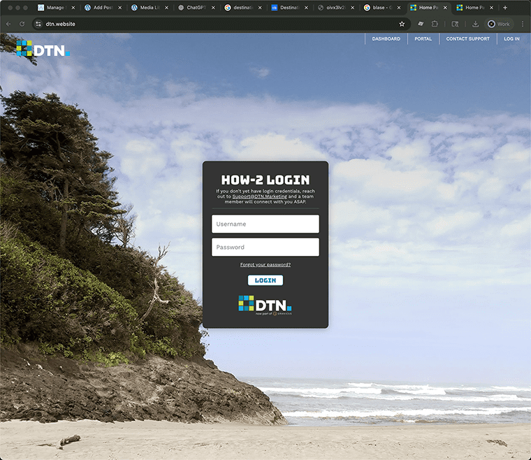
And I introduced a dedicated back-end portal where prospective customers could demo the DTN Website product and access a library of HOW-2 articles about digital marketing best practices.
It still stings.
Eight years of my career just tossed to the side with as much as a “thank you” from my managers or colleagues — it’s a tough pill to swallow. But I delight in the reality that my team and I made strides at DTN that the organization could never have accomplished without us. And my direct contributions to DTN’s brand strategy will have long-term effects on the way DTN is perceived by both SMBs and DMOs.