Kurtis
Kurtis
Kurtis

Durfey
Durfey
Durfey

Strategic Marketer
Graphic Designer
Manager
Identity + Business Systems

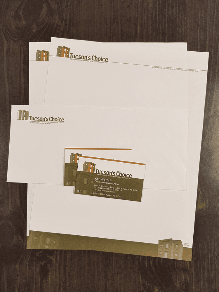
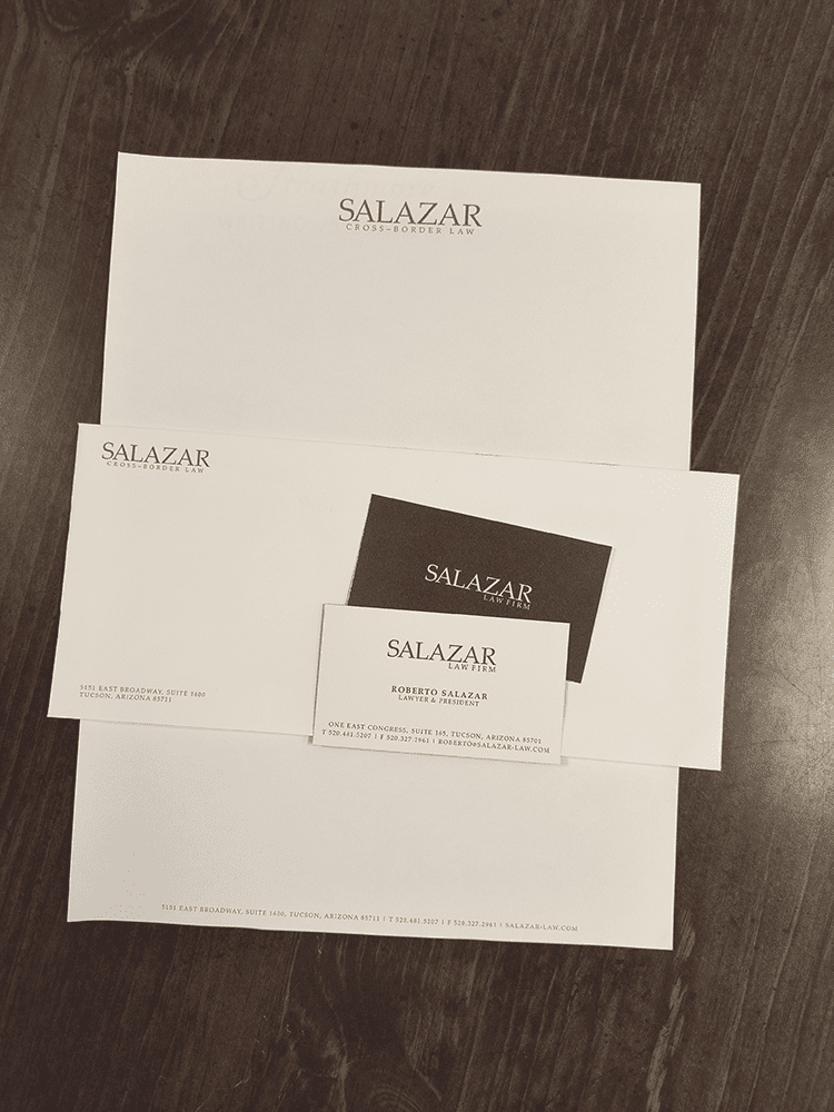
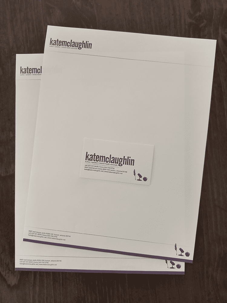
Old-school standard deliverables for new logo design clients.

Before the world was consumed by smart phones and Facebook, the go-to means of business communication was still old-fashioned direct mail. Letterhead and envelopes were printed en masse and stashed in the office cupboard (often with blank stock for second pages) and often in a dedicated LTR tray in the office printer so invoices, statements, collection efforts, and other formal correspondence could be quickly sent to the printed, hand-folded, stuffed into a pre-printed #10 envelope with a 29¢ stamp, and sent in the outgoing mail to be delivered in a few days.

For graphic designers, the business system — which typically included business cards for key client-facing team members, letterhead, a #10 business envelope, and possible pre-addressed #9 return envelopes — was a standard deliverable for all identity development!

I can smell the ink now!
3D XMas Cards

3D XMas Cards

My wife and I used to go all-on for Christmas cards, investing indefensible amounts of time and money on an annual creative venture that was as fun for us to produce as it (hopefully) was for our family and friends to receive it. One year, we shipped a stack of printed 3D photos with the old-school red-and-blue 3D glasses for a genuinely old-school immersive look into our holiday season! Dawn...

read more
Family Projects

Family Projects

Highlights from dozens of pro bono family projects As the only graphic designer in a family with eight siblings, I was often involved with the design and printing of announcements and invites for special occasions. My twin brother would famously volunteer me for for design work claiming that "it would only take ten minutes." The truth it, I enjoyed these projects immensely as opportunities to...

read more
DTN Brand Refresh

DTN Brand Refresh

The case of the blasés: a much-needed corporate brand overhaul When I joined DTN in 2017, the company's logo was suffering from a serious case of the blasés, featuring a decades-old "all-lowercase" treatment for the acronym mark with a predictable early 2000s light/heavy type treatment, a cliché mid-90s mouse icon, a random swoosh, and a gloomy blue, sea green, and dark grey color palette: The...

read more